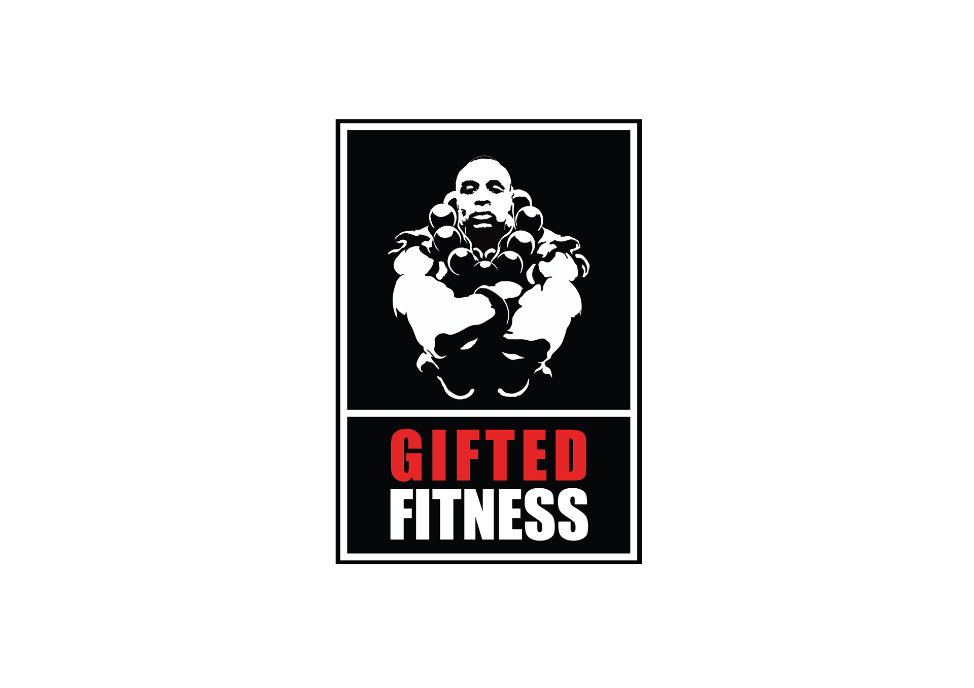
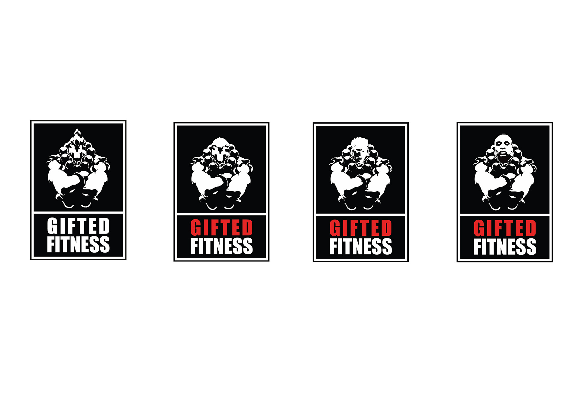
Gifted Fitness wanted to develop their brand identity, to enable their target market to recognise their services and differentiate themselves from the rest of the competition. The logo has to be simple but effective in order to illustrate the nature of the business to the target market.
Working with the guidelines of the organisation, the logo has been designed from concept to completion providing a unique look, as well as incorporating the theory of semiotics to appoint the right colours to represent that particular industry and to communicate their brand identity to their target consumer.